How I See Things – 4
I’ve been doing these How I See Things posts to breakdown the elements of composition I find when exploring with photography. I find it fascinating how these elements lead your eye around an image, and I intentionally try to use them to my advantage when painting a picture. It’s like mind control!
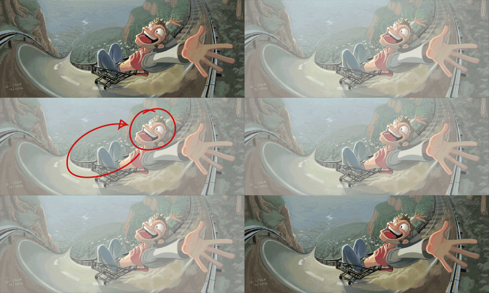
I put a fair bit of thought into this painting I did for my brother a while back:
I want your eye to start at the face, so I made sure to make it the greatest point of contrast. Both in terms of value and saturation. Starting there, you’ll visually go for the ride down the path. Which I originally had receding to the horizon, but realized I could pull it right back into the face. Soon as I did that, I noticed my eyes repeatedly went around this happy little ride of doom, and was super pleased with how visually exciting it was to look at.
Two other things I’d point out, is that I attempt to enhance the visual impact of the hill by angling all the dominant straight lines toward it, and made an effort to place the two key points of interest on the 3rds grid to keep it reasonably balanced.
Let me know what you think! And remember that you can subscribe in the left sidebar if you’d like to see more of these posts.
Frostingshire
This week on Silly Fun Paintings, James posted:
Which was then finished off by Jeff:
Run ice cream man, RUN!
Berryshire
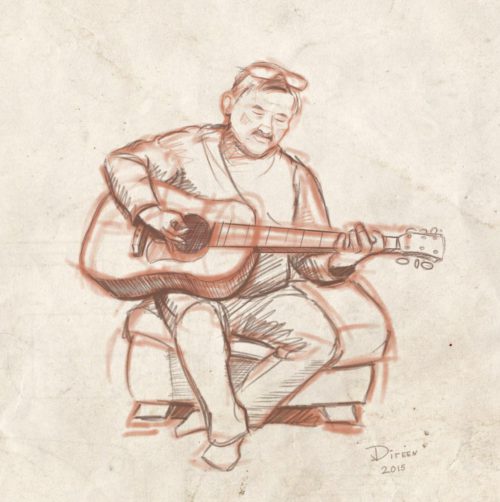
Strumming a Tune
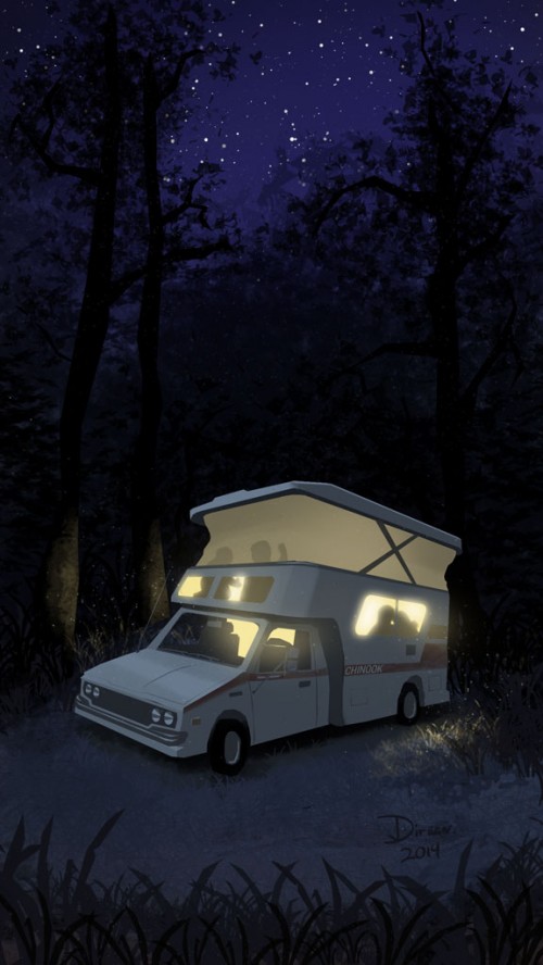
Toyota Chinook
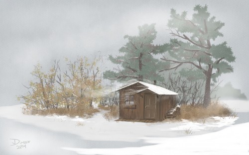
Snowy Shed
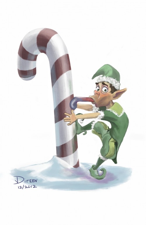
Merry Mihthmuth!
How I See Things – 3
This one is pretty simple and straight forward, which most compositions should be.
I keep my eye out for ying yang relationships. Characteristics that balance out, in an equal but opposite manner.
Not everything will always line up, but I think it helps to favor these relationships when you spot them, which led me to crop this photo the way I did.
How I See Things – 2
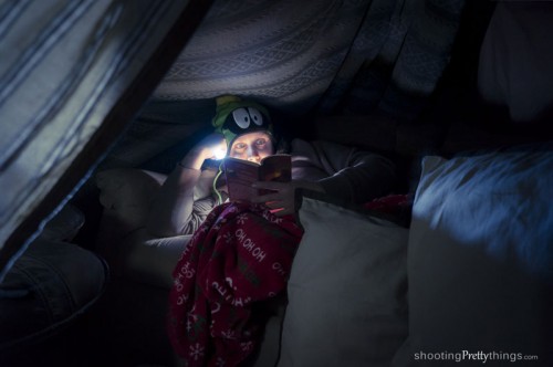
In the peril of a power outage, my survival instincts kicked in and I built a fort. Next of course, I needed to take a picture of my awesome fort.
As candid as it may look, I actually put effort into capturing this scene. Used my phone for wireless control over the camera, a remote flash concealed behind the book, and a couple out of frame flashlights to fill in the environment. I took my time to craft this image.
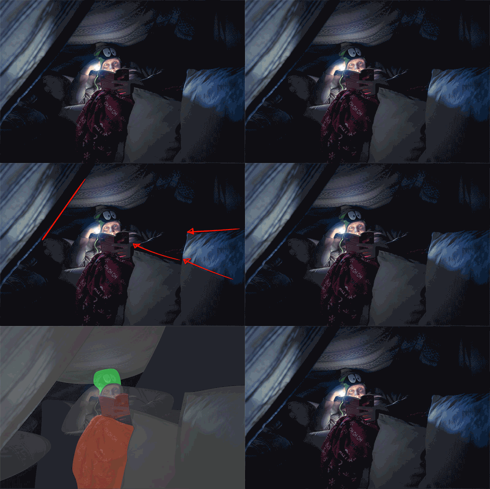
First, I situated the pillows so their lines would lead to my face. I then pulled the curtain to counter those lines and add to the look of coziness. Next, I was conscious of keeping everything fairly monochromatic; with exception to the red and green (color compliments) at the center of interest. Though I wanted to fill out the environment and tell the story of what is going on; ultimately, I aimed to hold the viewers attention tightly — keep them visually as cozy as I was :)

