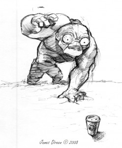
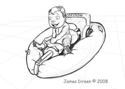
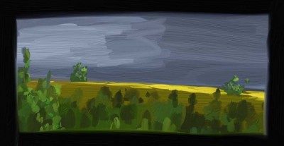
Had a bad case of the Mondays and this came out…
All posts by James
The sticky note of animation software
It’s called Pencil and it is fantastic! It is opensource software, which means two things: one, it’s free, and two, it has a few bugs… : ) Though nothing that will stop me from using it, and I expect things will improve pretty quickly judging by the care that the developers have been putting into it. I wouldn’t want to use it for any full polished animation, I’ve got TVPaint 7 (a.k.a Mirage) for that; however where this guy shines is being able to pop it open and go! Very un-bloated, clean, intuitive software.
This is a test I did in what I think was about an hour (though it may have been a bit longer… time seems to fly when I’m animating : )
The drawing tool doesn’t produce a clean line yet, which causes me to make “chicken-scratch” lines. But like I said, I’m not interested in this program for it’s quality, but it’s speed. I’d like to write some scripts that lets me cleanly interface it with Maya. Ultimately using it as part of my 3D workflow. I’ve been wanting to do this since I saw how effectively Jason Ryan (a Disney Animator) works with DigiCel’s FlipBook software, as can be seen here: http://www.digicelinc.com/3D/3danimationJR2.htm
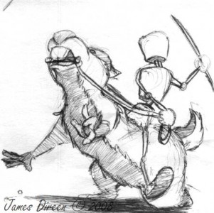
Chipmunk Rider
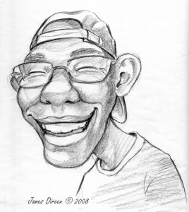
Ericature
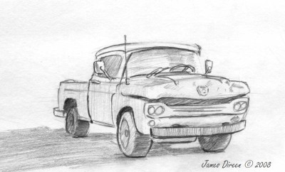
Truck
A paintodoodle of my Dad
Counter Climb
Talk about your random subjects. It seems somewhat reasonable for me to sit down and do a random sketch of whatever hits my mind, but an animation?! 10 to 15 hours is a lot of time to put toward a half baked idea.
Why did I decide to animate a girl climbing over a counter? I wanted to do something that would challenge me in terms of body mechanics and construction. Something that wasn’t just about going from one pose to another but had more of a continuous flow. Something that moved both dynamically and dimensionally. So this idea seemed to fit when I came across one of those random sketches I had done of a girl standing at a counter.
This animation is not all that entertaining, but I learned a lot from it! For Instance: Planning out the timing for animation is IMPORTANT! Not for just the subject as a whole which is obviously important, but the individual aspects of that subject. What will be the spacing for the hips, the torso, the head, the arms, etc. they can each move at separate speeds, and generally should.
In animation terms the concepts of moving elements with different timing are referred to as overlap, follow through, and secondary motion. They are fundamental concepts that I learned long ago and have been using for years, but this animation really drove home the importance of giving some deeper thought and planning consideration as to how your going to use them in your animation.
Anyone who has done much computer animation, might understand why it has taken me so long to have this epiphany. With the computer it is so easy to adjust things as you go. Speeding things up or slowing them down is just a matter of sliding a red bar on the timeline (i.e. “oh, the hands are hitting at the same time as everything else… let’s just move that key back a smidgon… there we go”) You do a lot of tweaking in the end to make everything look good, and it does, but you end with the result that you “found” rather than one that you intentionally created.
I’m not sure that I’m making a whole lot of sense to anyone but myself… In an attempt to clarify it: A lot of time is spent on posing a character to describe what they are doing, but it is the timing that tells of the way in which they are doing it. It is easy enough to adjust on the computer, but it shouldn’t be left as an afterthought. A characters attitude and personality comes out through the timing and spacing and thus should be given as much thought as the posing and general movement itself.

